
Why did Julius Pringles lose his hair?
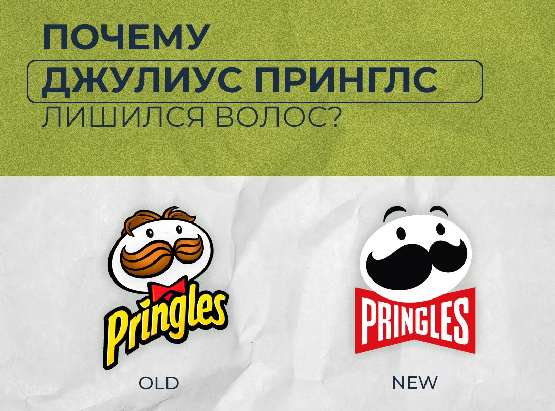
The Pringles brand’s moustachioed mascot has had a makeover for the first time in 20 years, courtesy of a redesign by creative agency Jones Knowles Ritchie.
The company has rebranded, refreshing its logo, typeface and packaging design. It is the same old Julius Pringles we know and love, but reimagined in flat design.
“The aim of the update is to simplify and modernise the design, give the brand mascot a bolder look and emphasise the signature stack and shape of the crisps, along with their wide range of flavours,” said Pete Matthews, design director for the Pringles brand.
Mr P has lost his hair, and that is one of the most noticeable changes to the logo. Even so, Pringles says that “at 54 he is still looking as handsome as ever” and that the visual update is “the boldest look for Mr P yet”. The new logo now has a pair of eyebrows and a large red bow tie (for the international version of the logo). An updated wordmark has also been designed, sitting inside the bow tie. It is worth noting separately that the bow tie already featured in earlier Pringles logos, going right back to 1967.
In the old version, the character’s bushy moustache stopped viewers from seeing an unintended reading of the counter-form of that iconic image; in the new, simplified version, however, many designers and internet users have pointed out that the moustache now reads as the gaping mouth of some fantastical, frightening creature.